Project
Launchpad
Client
Class Project
We implemented a simple yet robust research plan that utilized two types of formative research methods — interviewing and card sorting. We aimed conduct these in person as this often yields better results than virtual interviews.
Firstly, two different closed card sorts were developed for user testing. The reason two card sort templates were developed was due to the nature of the closed card sort. With a closed sort, it is often hard to find variety in the answers given as designers will tend to create cards to fit into previously created categories. By reversing this process, creating the cards then categories, and having multiple different closed sorts, we will be able to achieve a better understanding of how our target users would like to see our application sorted. Both card sort tests will be completed by each interviewed user.

Secondly, the following questions for a structured interview were developed:
- What inspired you to study UX design, and what do you hope to gain from your studies?
- What was your experience like in your first UX course, and what were the most valuable lessons you learned?
- What challenges have you faced as a new UX student, and how have you overcome them?
- What resources would be most helpful for a website aimed at teaching first-year UX students about the field and connecting them with mentors?
- What are your goals for the future in the field of UX design?
- Are you currently located in Waterloo, and do you plan to move after you graduate?
The reason a structured interview was chosen, over semi-structured or open, was on account of consistency among answers. We felt it was important that all interviewees were asked the same questions because this would yield many different ideas about the same concepts we hope to focus on. Furthermore, that is why it was very important to have our structured interview be as open as possible, i.e., many different ways to answer the questions we developed.
Persons to be interviewed were selected randomly from either the Wilfrid Laurier University Waterloo or Brantford campus who fit (or closely fit) the following proposed target user description:
- A person who is a young adult in their first/second year of university, who intends on pursuing a career in the User Experience Industry
- A person who is ambitious and takes their career seriously
- A person who is creative, and appreciates high quality and innovative design
Based on the results of our user research, we were able to develop a user persona that represents a typical user of our application.

PAIN POINTS
Oversaturation in the market.
The UX space has grown in popularity in recent times due to the changing digital world, we are at a point where the job market is highly competitive. Individuals hoping to pursue a UX related career are going to have a hard time finding a job if they do not differentiate themselves effectively. Our users have claimed to have faced these conditions first hand and truly understand the degree of difficulty associated with trying to find employment in a competitive job market.
Information overload (for those relatively new to the space).
There are many different facets of the industry that can make it intimidating for a young professional starting out, our respondents have reported an overwhelming amount of information associated with the UX industry due to the fact that there is such a wide variety niches to pursue.
Even if the existing UX career resources available (The UX Design Institute, Interaction Design Foundation, CareerFoundry, Udemy, and Coursera) offer a variety of courses and learning materials, they don't offere particular gyudance on the best ways to succeed in the UX industry. This includes best practices for networking, showcasing one’s portfolio and skills effectively, etc. They don’t have a specific design or feature to address these aspects, and the focus is mainly on teaching the technical skills and knowledge that is required for users.
The ever-changing and complex nature of the UX industry.
Our respondents have reported difficulties with trying to meet all of the demands that employers have of them and trying to keep up with the trends in the industry.
Higher barriers to entry due to the lack of UX career development resources available.
Looking for their first UX job, many users had no idea where to start because breaking into the UX space isn’t as simple as breaking into accounting or finance where you can find roles through your schools coop program, students need a place where finding UX roles can be made simple
OPPURTUNITIES
- a resource/tool that will provide them with the knowledge, experience, and connections to have a successful career in the UX industry
- find like minded individuals who share their passion for user experience
- a platform that is dedicated to all things user experience so that they can jump start their careers
- a place they can share their knowledge, and projects so that they can receive feedback from their peers
By constantly updating and adapting the UX Career Launchpad with the latest industry trends and user needs, helping users stay ahead of the curve. Additionally, by making it accessible, and free, users can start on their pursuit of a career in UX with minimal intimidation and effort through simplified and concise information. Because the Launchpad provides a hands-on experience, users can become more confident in their abilities to design for real problems in the real world that can be applied to a job.
Low-fidelity creation
Paper sketches were used to develop a low-fidelity prototype with some basic interactivity, essentially making it a pseudo-clickable wireframe. This allows us to better determine feasibility and usability.
Why use paper sketches?
It's easy to create and modify, and allows for quick feedback. Plus, they are easy to navigate, allowing tests with users to be done in a short amount of time and to identify any usability issues quickly.
We started off by reviewing the user persona previously developed. The following are the key features and functionalities that would be important for our user needs and goals, and were used as a foundation for our design:
- Personalized user profiles with the ability to showcase work experience and skills
- Job search functionality where users can search for jobs that match their skills and interests
- Networking features, such as connecting with other professionals in the industry
- Mentorship feature to be able to connect young professionals with experienced mentors
- A newsfeed to keep users up-to-date on relevant industry news and events
- A messaging system for communication between users, including messaging with mentors and potential employers
- Learning modules with educational materials and quizzes for skills and knowledge development
We focused on the layout and organization of key components such as the dashboard, learning modules and networking features.

After creating the wireframes for the mobile view of the website I ran two rounds of testing: one to test usability, and a heuristics evaluation. This was done with a group of 10 users, allowing for a diverse range of perspectives and insights while still being manageable. Each round of iteration got us closer to a better design, tackling the goals we set out to achieve.
Usability Test
We kept this relatively basic considering the limitations of paper sketches. Users were asked to complete the following tasks: Find where you can send direct messages, browse all learning modules, and schedule a meeting with a UX professional.
Metrics to Determine Effectiveness
- Success rate/task completion rate: Percentage of tasks successfully completed by participants without assistance. A high task completion rate ensures that the design is intuitive and easy to use.
- Time on task: Time taken by participants to complete each task (measured in seconds). A shorter time on task indicates that the design is effective and efficient.
- Error rate: Number of errors made by participants while completing each task. For clarity, a mistake is classified as any error in button selection, misinterpretation of the use of a feature on the application, or a use of the back button. A low or zero error rate indicates that the design is error-free and user-friendly
Metrics Results
Success rate -> 80%:
This indicates that our application is user-friendly and intuitively simple to navigate. Most respondents completed their tasks with ease and without errors. The familiarity of our application, similar to Instagram and Linkedin, contributed to its easy navigation for users.
Time on task: There were some barriers around terminology that made it slightly difficult, and sometimes users second guessed themselves when pressing a button. This can be expected with any new application, however this also highlights the importance of providing sufficient tutorials for new users. On average, users completed the task in 1 minute, on the lower end we saw a completion time of 28 seconds, and on the higher end we saw a completion time of 94 seconds.
Error rate: 80% of participants were flawless, meaning that achieved an error rate of 0%. The other 20% made 1 or 2 mistakes when attempting to navigate the application, but this is expected because the application includes terminology that is different from what users might have seen before.
Post-test completion interview portion (open-ended)
An open-ended interviewing portion was added to help bring forth qualitative data such as ease of use and satisfaction. The following prompts were asked following test completion:
- After completing the previous scenarios, provide feedback on the application's usability, design, and features.
- Share your overall impression of the application and its purpose.
- Comment on the ease of navigation and user interface.
- Provide any additional suggestions or comments on how to improve the application.
Due to the nature of large amounts of qualitative feedback received, we decided to only include the feedback that acted change within the design.
Finding #1
While completing the tasks, many of the buttons were too small and the icons in the application were all a bit too similar.
Allocate more space on the screen for the taskbar and its buttons. Furthermore, greater differentiation was required for the buttons contained on that taskbar.
Finding #2
Many of the screens were hard to tell apart. In particular, the search screen and the direct messaging interface.
Further global differentiation was needed. This is important as it is essential to inform the user what specific part of the application they are using to ensure proper flow and ease of use
Finding #3
The amount of information displayed on each screen was a bit overwhelming.
Reduce the amount of information displayed on most screens to achieve a higher quality, yet minimalist, design. Additionally, reduce the amount of navigation options per screen to reduce possible user confusion. By contrast, this would have the potential to lead the application to have many more screens than necessary so the design team needed to be careful with this feedback.
Heuristics Evaluation
Through a closed Wizard of Oz testing method, we found that 3/10 of the heuristics could be improved.
Match between system and the real world
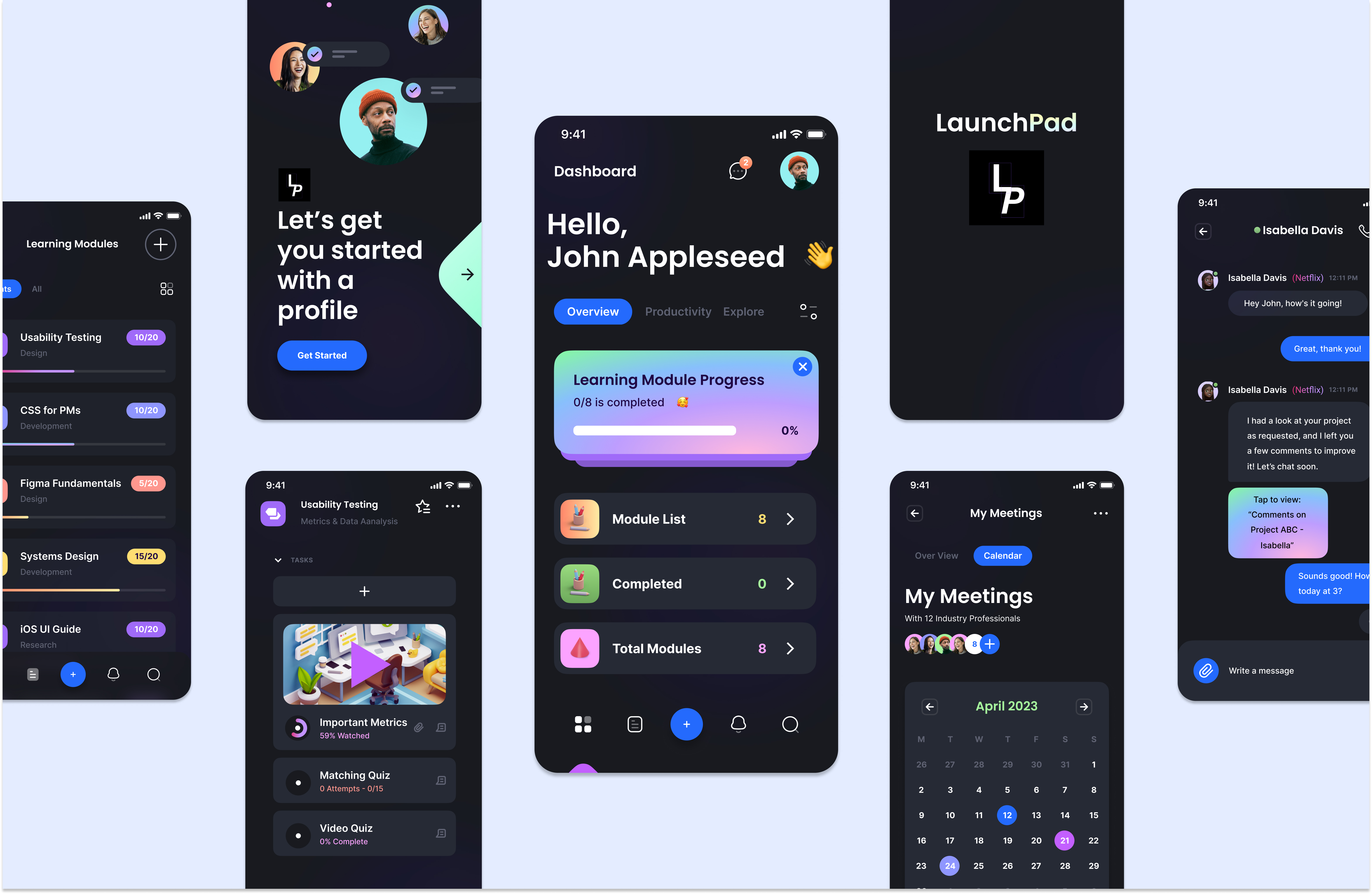
Much of the feedback from the first usability test and interview mentioned the confusing button icon choices that did not differentiate from each other enough. So, when creating the second prototype, we took into account these concerns and essentially solved this heuristic problem. The application buttons use commonly found icons in many other popular applications today (Magnify glass icon - for search, plus icon - for create, bell icon - for notifications, etc.), and the lingo for page navigation is broad and attempts to not be specific to UX design (i.e., ‘Dashboard’, ‘Explore’, ‘Overview’, ‘Learning Modules’, etc.)
User control and freedom
A back button that can be used globally has already been implemented. However, a cancel button would come in very handy in some parts of the process.
Help and documentation
Help and documentation is something we forgot to consider. So then we added a help customer service section. This section can instruct users on how to navigate the application and/or show available customer service phone lines if further assistance is necessary.
With these consideration in mind, a final high-fidelity prototype was created.

Outcomes
Our final redesign process began by analyzing the results of our heuristic evaluation and second usability test. We identified areas that needed improvement, including the mistakes made by users in our usability test and the ease of interpreting new features. We brainstormed ways to make the application more informative and efficient without overloading the interface.
We began modifying the high-fidelity prototype to incorporate updated features. These features were based on what was learned during the heuristic evaluation and second usability test. We ensured that our prototype was well-designed, labeled, and described, with an organized and straightforward user interface.
However, we encountered several challenges during the final redesign process, which required us to troubleshoot and find solutions. One of the main issues was finding the right balance between implementing new features and simplicity. We wanted to provide users with the added features to navigate the application effectively without overwhelming them with too many buttons and options.
More specifically, our design faced some confusion based on placement of new features and additional button placements. As a result, we conducted some additional testing, specifically many iterations of the 5-second usability test, displaying multiple different possible interface layouts to our subjects. Based on the feedback received from this test, we chose the most appropriate layout to incorporate these new features.
Overall, our troubleshooting efforts allowed us to address the key issues we discovered during our second round of testing and provided a better user experience.